一 布局方法
1 准备工作
2 布局思路
以文档流中的每个占一整行的块级元素为主线,将整个网页切分成多个横条的块容器。
在某一个文档流中的横条的块容器内,通过 float 属性使用多个容器排列,分割成多列(其父元素即横条的块容器记得清除浮动 clearfix)。
用递归的思路,此时这个横条的块容器内的某个 float 的容器即看作是一个新的文档流,再次进行布局。
3 详解
在文档流中的块级元素,都是独占一行。通过这个性质将整个网页切成若干个横条块。
只要是想将某个横条块分割成多列的块,就用 float 属性;同时记得其父元素必须清除浮动(不然父元素会因为子元素变成浮动的而失去高度)。
如果有多层嵌套,最里面的块级容器设不设置成 float 无所谓,但是其父元素要设置成浮动(参考),不然子元素在设置 margin 值时会和父元素的 margin 重叠(也就是说子元素的 margin 并不会在父元素的内容里,而是在其外)。当然不给父元素设置成 float,也可以用绝对定位或设置其他属性达到目的。
竖着布局块元素就是在文档流中布局。/ 然后想在文档流中的某横块元素中布局多列块元素,则这几个列块元素设置为 float,同时某横块元素设置清除浮动。/ 每个容器都可看作是一个文档流,然后在这个容器(文档流)中再布局。
4 div + CSS 布局小结
- 横着布局块元素,将页面或容器横着分成若干个条状块区域。
- 想把哪个条状块区域分割成几个列区域,就将子元素若干个列块设置成 float,同时其父元素条状块清除浮动。
- 每个块都可看作是一个新的文档流,然后在其中分成若干个条状块区域,或分割成几个列块区域。
- 使用递归的思想。
- margin 是元素之间的距离。记得 padding、border 也会占距离,一开始设计时就要考虑,因为设置的宽度高度是内容的(也可以通过 box-sizing 属性设置,默认值是 content-box),后添加 padding、border 的话,距离会向外扩展。
5 注意
参考:
1、 设计网页,常见的宽度是多少像素?
2、 流布局与响应式网页设计有什么区别?
- PC 屏幕:
- 条状块区域左右使用 margin auto,设置固定宽度来确保此条状区域位于文档流中央,不会因为屏幕改变而使整个网页宽度变形(具体宽度可以使用 1024px 为基准)。/ 使用 flex 布局。/ 页面宽度小于等于手机竖着的屏幕宽度,同时两边的 margin 设为 auto;高度在网页主区域上下使用 vh。这样手机、PC 上都可以正常显示。
- 适配不同屏幕:
二 示例代码
1 HTML
1
2
3
4
5
6
7
8
9
10
11
12
13
14
15
16
17
18
19
20
21
22
23
24
25
26
27
28
29
30
31
32
33
34
35
36
37
38
| <!DOCTYPE html>
<head>
<meta charset="UTF-8">
<meta name="viewport" content="width=device-width, initial-scale=1.0">
<meta http-equiv="X-UA-Compatible" content="ie=edge">
<link type="text/css" href="./main.css" rel="stylesheet">
<title>Test Web</title>
</head>
<body>
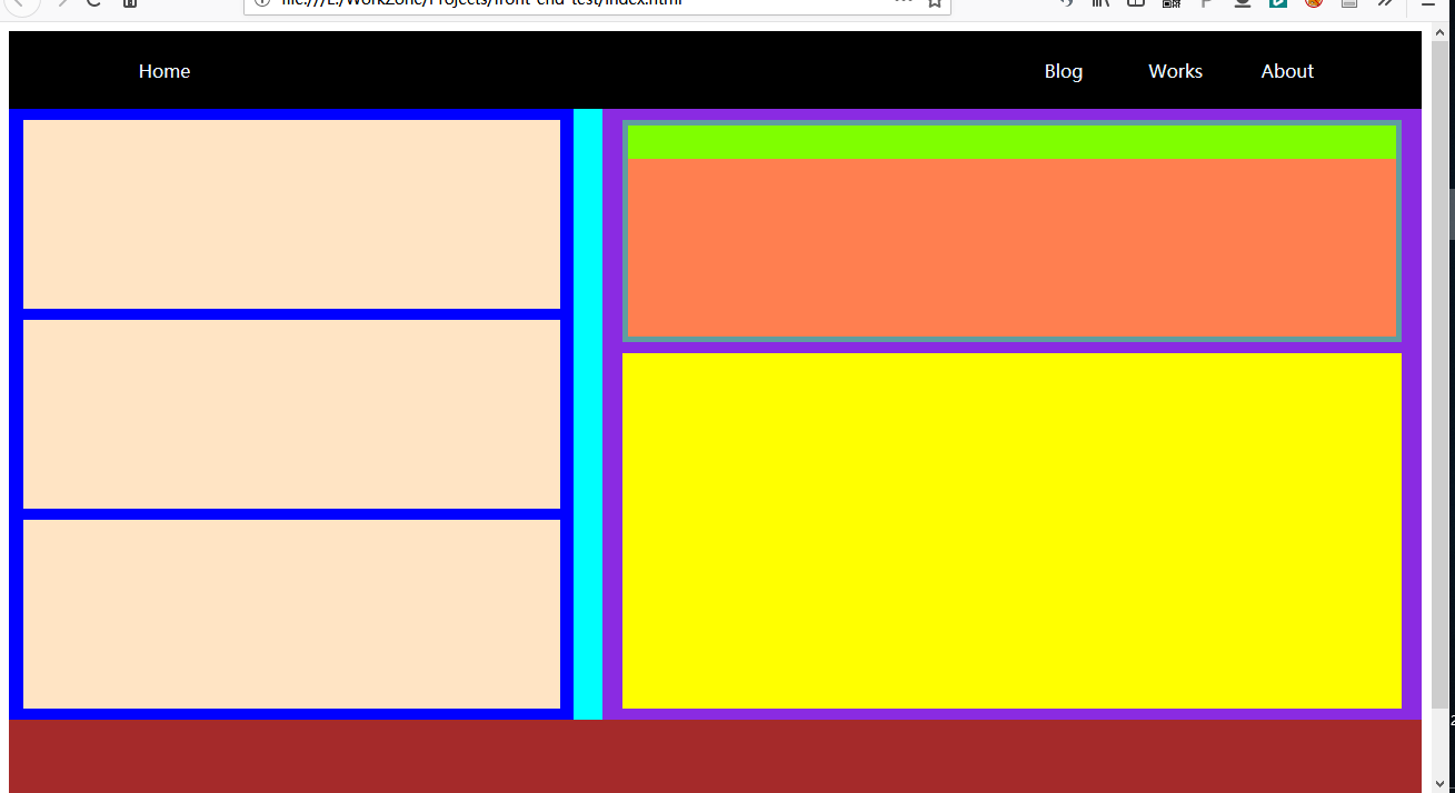
<div class="nav clearfix">
<div class="nav-left-item">Home</div>
<ul class="nav-right-item">
<li>Blog</li>
<li>Works</li>
<li>About</li>
</ul>
</div>
<div class="content clearfix">
<div class="content-left">
<div class="content-left-item"></div>
<div class="content-left-item"></div>
<div class="content-left-item"></div>
</div>
<div class="content-right">
<div class="content-right-top">
<div class="content-right-top-bar"></div>
<div class="content-right-top-articles"></div>
</div>
<div class="content-right-bottom"></div>
</div>
</div>
<div class="footer clearfix"></div>
</body>
</html>
|
2 CSS
1
2
3
4
5
6
7
8
9
10
11
12
13
14
15
16
17
18
19
20
21
22
23
24
25
26
27
28
29
30
31
32
33
34
35
36
37
38
39
40
41
42
43
44
45
46
47
48
49
50
51
52
53
54
55
56
57
58
59
60
61
62
63
64
65
66
67
68
69
70
71
72
73
74
75
76
77
78
79
80
81
82
83
84
85
86
87
88
89
90
91
92
93
94
95
96
97
98
99
100
101
102
103
104
105
106
107
| .clearfix::after{
content: " ";
clear: both;
}
/* nav */
.nav{
height: 70px;
width: 100%;
background-color: black;
}
.nav-left-item{
float: left;
height: 70px;
width: 120px;
margin-left: 80px;
color: aliceblue;
text-align: center;
line-height: 70px;
}
.nav-right-item{
float: right;
height: 70px;
width: 320px;
list-style: none;
margin: 0 50px 0 0;
padding: 0;
}
.nav-right-item li{
display: inline-block;
height: 70px;
width: 30%;
color: aliceblue;
text-align: center;
line-height: 70px;
}
/* content */
.content{
height: 550px;
width: 100%;
background-color: aqua;
}
.content-left{
float: left;
height: 550px;
width: 40%;
background-color: blue;
}
.content-left-item{
height: 170px;
width: 95%;
margin: 10px 2.5% 0 2.5%;
background-color: bisque;
}
.content-right{
float: right;
height: 550px;
width: 58%;
background-color: blueviolet;
}
.content-right-top{
float: left;
height: 200px;
width: 95%;
margin: 10px 2.5% 0 2.5%;
background-color: cadetblue;
}
.content-right-top-bar{
height: 30px;
margin: 5px 5px 0 5px;
background-color: chartreuse;
}
.content-right-top-articles{
height: 160px;
margin: 0 5px 5px 5px;
background-color: coral;
}
.content-right-bottom{
float: left;
height: 320px;
width: 95%;
margin: 10px 2.5% 0 2.5%;
background-color: yellow;
}
/* footer */
.footer{
height: 120px;
width: 100%;
background-color: brown;
}
|