参考:
1、 CSS flex 属性
2、 Flex 布局语法教程
3、 30分钟彻底弄懂flex布局
4、 flex布局思维导图
一 flex 布局概述
- 主轴、交叉轴(容器)
- 容器成员(项目)
二 flex 布局思路
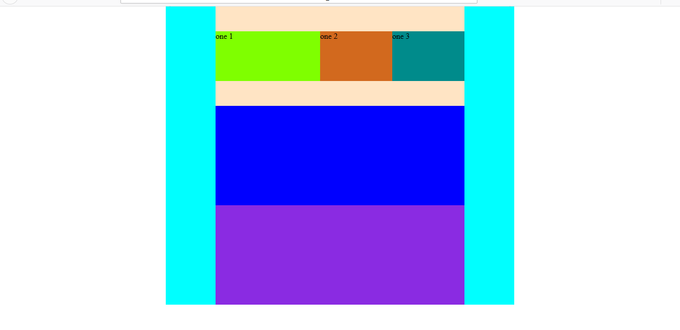
body 为一个大容器。以一个容器中嵌套 3 个容器,这 3 个容器中再放入若干个容器成员为例。
1 思路
- 设计:
- 先设计出整个布局,容器和容器、容器成员的嵌套关系。
- 容器中可以嵌套容器。当多层嵌套时,某个容器既有容器属性(作用于它的子元素)又有项目属性(作用于自己,对于自己的父元素而言)。
- 实践:
- 可以将整个网页作为 flex 容器,或直接在网页中添加一个主 flex 容器。所有容器均为
display: flex;。 - 然后按照设计图,搞清楚整个布局的嵌套关系。
- 设置父容器的属性:轴方向 flex-direction、换不换行 flex-wrap、子项目的对齐方式 justify-content/align-items。
- 设置父容器的盒子模型尺寸等(如长、宽)。通过 flex 布局,不需要使用
margin: auto;来居中布局。 - 设置项目的属性:order、flex-grow、flex-shrink、flex-basis 等。
- 设置项目的盒子模型尺寸等(如长、宽)。通过 flex 布局,不需要使用
margin: auto;来居中布局。
2 代码实例
HTML:
1
2
3
4
5
6
7
8
9
10
11
12
13
14
15
16
17
18
19
20
21
22
23
24
25
26
<!DOCTYPE html>
<html lang="en">
<head>
<meta charset="UTF-8">
<meta name="viewport" content="width=device-width, initial-scale=1.0">
<meta http-equiv="X-UA-Compatible" content="ie=edge">
<link href="https://cdn.bootcss.com/normalize/8.0.1/normalize.min.css" rel="stylesheet">
<link href="./main.css" rel="stylesheet">
<title>flex</title>
</head>
<body class="basic">
<div class="container-main">
<div class="container-one">
<div class="item-one-1">one 1</div>
<div class="item-one-2">one 2</div>
<div class="item-one-3">one 3</div>
</div>
<div class="container-two">
</div>
<div class="container-three">
</div>
</div>
</body>
</html>CSS:
1
2
3
4
5
6
7
8
9
10
11
12
13
14
15
16
17
18
19
20
21
22
23
24
25
26
27
28
29
30
31
32
33
34
35
36
37
38
39
40
41
42
43
44
45
46
47
48
49
50
51
52
53
54
55
56
57
58
59
60
61
62
63
64
65
66
67
68
69
70
71
72
73
74
75
76
77
78
79
80
81
82
83
84
85
86
87
88
89
90
91
92
93
94
95
96
97
98
99
100
101
102
103
104
105
106
107
108
109
/* body */
.basic{
display: flex;
flex-direction: column;
flex-wrap: nowrap;
justify-content: center;
align-items: center;
}
/* main container */
.container-main{
display: flex;
flex-direction: column;
flex-wrap: nowrap;
justify-content: center;
align-items: center;
background-color: aqua;
height: 600px;
width: 700px;
}
/* sub container */
.container-one{
display: flex;
flex-direction: row;
flex-wrap: nowrap;
justify-content: center;
align-items: center;
background-color: bisque;
height: 200px;
width: 500px;
}
.container-two{
display: flex;
flex-direction: row;
flex-wrap: nowrap;
justify-content: center;
align-items: flex-start;
background-color: blue;
height: 200px;
width: 500px;
}
.container-three{
display: flex;
flex-direction: row;
flex-wrap: nowrap;
justify-content: center;
align-items: flex-start;
background-color: blueviolet;
height: 200px;
width: 500px;
}
/* sub container items */
.item-one-1{
display: flex;
flex-grow: 2;
background-color: chartreuse;
height: 100px;
width: 80px;
}
.item-one-2{
display: flex;
flex-grow: 1;
background-color: chocolate;
height: 100px;
width: 80px;
}
.item-one-3{
display: flex;
flex-grow: 1;
background-color: darkcyan;
height: 100px;
width: 80px;
}
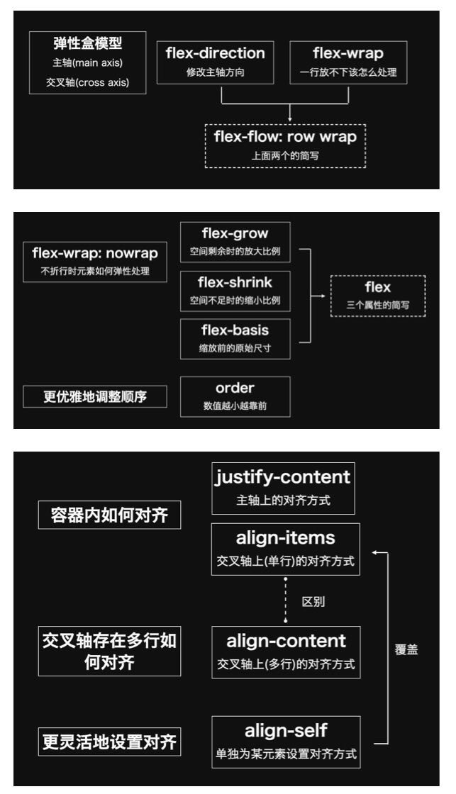
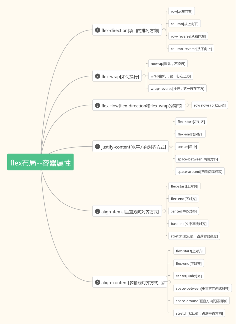
三 flex 布局具体属性(转载)
容器属性:
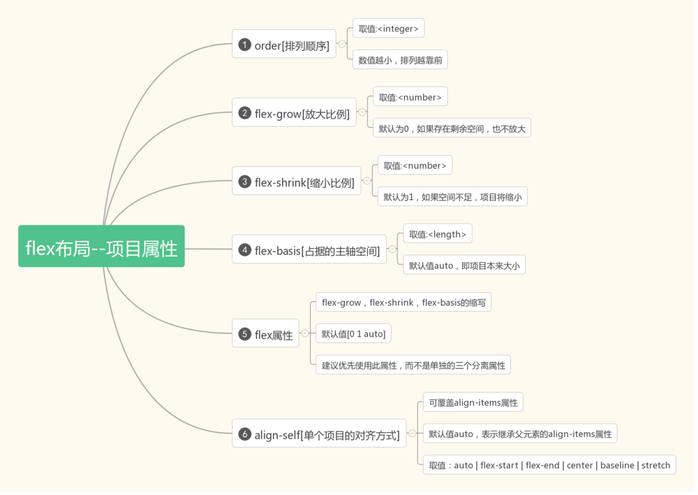
项目属性: